Table of contents
Part 1 - What Are the Main Types of Charts in Forex Trading?
Part 2 - Line Chart in Forex Trading: When and How to Use It?
Part 3 - Bar Charts in Forex Trading: Interpreting Price Movements
Part 4 - Candlestick Charts: The Trader's Favorite for Forex Analysis
Part 5 - Renko and Heikin-Ashi Charts: Non-Traditional Forex Strategies
Part 6 - Comparing Chart Types: Which Forex Chart is Best for Your Strategy?
Part 7 - How to Choose the Right Forex Chart for Successful Trading?

If you've ever dabbled in Forex trading, you know that reading charts is like learning a new language. A trader's screen isn't just lines and bars—it's a roadmap to profit (or loss). In the world of Forex, understanding which are the types of charts in Forex trading can make all the difference. From the straightforward Line Chart to the story-rich Candlestick Chart, each one has its own way of spilling market secrets. Picking the right chart isn't just smart; it's essential for spotting trends before they become obvious.
As the legendary trader Jesse Livermore once said, "The market is never wrong—your interpretation of it usually is." That interpretation begins with mastering chart types. Knowing when to use a Bar Chart versus a Heikin-Ashi could be the edge you've been looking for.
In this guide, we're diving deep into the most popular chart types, comparing their strengths, and showing you how to match them with your trading style. By the end, you'll not just understand the charts—you'll speak their language. Ready to trade smarter? Let's get started.
1. What Are the Main Types of Charts in Forex Trading?
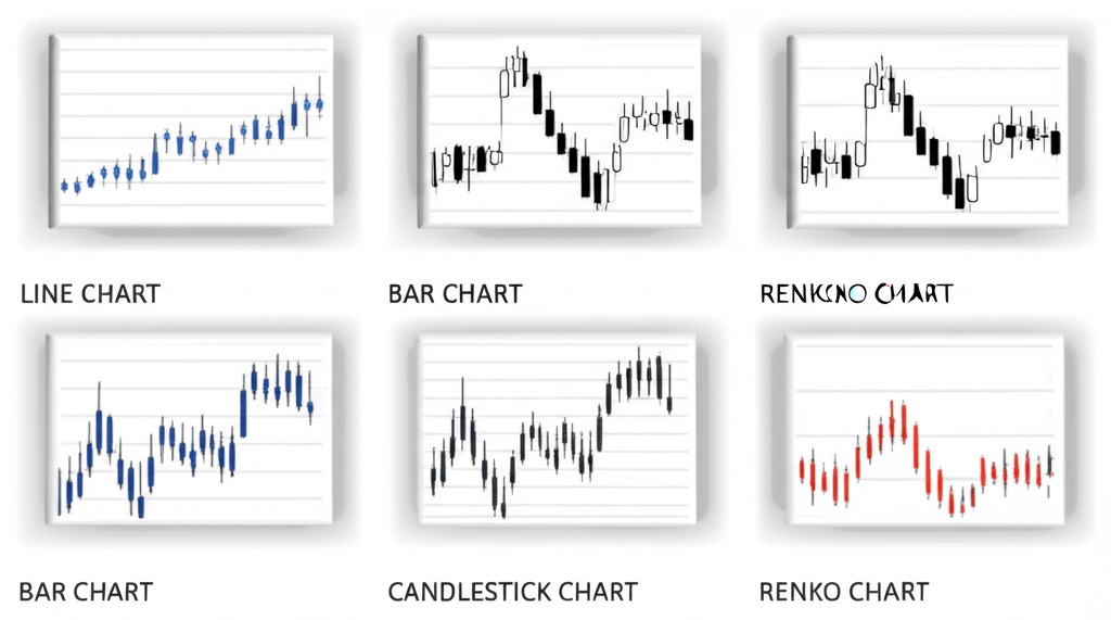
Forex trading is a dynamic and fast-paced environment where traders constantly seek ways to visualize and analyze price movements. One of the most critical aspects of trading is understanding chart types, as each chart offers unique insights into the market. Let us explore the primary types of charts in Forex trading, breaking down their characteristics and practical applications.
Line Chart: Simplicity at Its Best
A line chart is perhaps the most straightforward way to visualize price changes. It connects closing prices over a specific period, forming a continuous line that represents the trend. Traders appreciate its simplicity, especially when analyzing long-term trends. The line chart’s focus on closing prices helps filter out market noise, making it ideal for spotting the overall direction.
Key Features:
Connects closing prices
Minimalistic and clear
Ideal for trend analysis
Best for: Long-term traders looking for straightforward trend visualization.
"I always start with a line chart when analyzing new pairs. It gives me a clean view without distraction," shares Mark Johnson, a seasoned Forex trader.
Bar Chart: A Comprehensive Price Snapshot
Bar charts add more depth to price analysis by displaying open, high, low, and close (OHLC) prices. This structure provides a fuller picture of market activity, crucial for identifying volatility and potential reversal points. The OHLC format is a favorite among traders seeking to gauge market sentiment.
Key Features:
Represents OHLC prices
Indicates volatility through bar length
Ideal for short to medium-term analysis
Best for: Traders focused on precise entry and exit points.
"Bar charts are like storytelling tools. Each bar narrates the price journey within a specific timeframe," explains Emily Davis, a financial analyst at FXPro.
Candlestick Chart: Visualizing Market Psychology
Among the most popular chart types, the candlestick chart provides a visually appealing and information-rich representation of price movements. Each candlestick reflects the open, high, low, and close, much like the bar chart, but with a body that clearly indicates the direction of movement.
Key Features:
Displays OHLC data in a visually distinct way
Color-coded for bullish (usually green) and bearish (usually red) moves
Patterns like “Doji” and “Hammer” reveal market sentiment
Best for: Traders analyzing short-term patterns and signals.
"A single candlestick can tell you so much! Whether it’s a bullish engulfing or a morning star, I instantly grasp the market mood," says Linda Carter, a trading mentor.
Renko Chart: Filtering Out the Noise
Renko charts differ from the previous types as they focus on price movement rather than time. Blocks (or “bricks”) appear only when the price moves a specified amount, ignoring time intervals. This makes Renko charts highly effective for identifying clear trends without the distraction of minor price fluctuations.
Key Features:
Emphasizes price movement over time
Filters minor fluctuations
Useful for trend-following strategies
Best for: Traders looking to minimize noise and concentrate on significant price shifts.
"When markets are choppy, Renko charts help me stay calm. They strip away the noise and let me see the real trend," notes David Lee, a Forex educator.
Heikin Ashi Chart: Smoothing Out Trends
The Heikin Ashi chart is a modified version of the candlestick chart. It uses average values to construct candlesticks, making trends appear smoother and more continuous. Traders often use this chart to reduce market noise and better understand trend direction.
Key Features:
Averages out volatility
Highlights sustained trends
Great for trend-following strategies
Best for: Traders who aim to stay in profitable trades longer.
"When I want to ride a trend without second-guessing every pullback, Heikin Ashi is my go-to," confides Jessica Morgan, a trend trader.
OHLC Chart: A Bar Chart Variant
The OHLC chart is essentially a bar chart, but its focus on the four critical price points (open, high, low, close) makes it a vital tool for technical analysts. It helps traders evaluate both the direction and strength of a price move within a given period.
Key Features:
Detailed price point representation
Highlights market sentiment shifts
Useful for volatility analysis
Best for: Technical analysts tracking daily and intraday movements.
Point and Figure Chart: Tracking Pure Price Action
Unlike traditional charts, the Point and Figure chart ignores time altogether. It focuses purely on price changes, marking movements as either X’s (upward) or O’s (downward). This method effectively eliminates insignificant price changes, providing a clear view of primary trends.
Key Features:
Tracks only significant price movements
Eliminates time from the equation
Simple to interpret long-term trends
Best for: Long-term traders seeking trend confirmation.
"Point and figure charts make my strategy cleaner. I do not get swayed by daily fluctuations," remarks Thomas Greene, a positional trader.
Why Understanding Chart Types Matters
In Forex trading, choosing the right chart type is not just a preference but a strategy. Different charts cater to different trading styles, from scalping to swing trading. Mastering each chart type ensures that traders can adapt their analysis to ever-changing market conditions. Whether you prefer the simplicity of line charts or the precision of candlestick patterns, the key is to understand what each chart reveals and how it aligns with your trading goals.
2.Line Chart in Forex Trading: When and How to Use It?
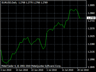
Line charts are a fundamental tool in Forex trading, offering a simple yet effective way to visualize price movements over time. Let’s break down their structure, benefits, and optimal usage.
Line Chart Structure and Features
A line chart typically consists of Axes that represent time (X-axis) and price (Y-axis). Data Points are plotted at regular Intervals and connected by Lines to form a continuous graph. The Title at the top clearly defines the data set, while Labels on each axis help interpret the Scale.
The chart often includes a Legend to identify multiple data series, and Markers might highlight specific points. For better readability, Gridlines are used as background reference lines. A key aspect of line charts is their ability to display Trends over time, making it easier for traders to spot Trend Changes.
Pros and Cons of Line Charts
Line charts in Forex trading come with their own set of Advantages and Disadvantages.
Advantages:
Simplicity: Ideal for quick visual analysis.
Clarity: Clearly shows Trends without Clutter.
Comparison: Easily compare multiple currencies.
Continuous Data: Suitable for showing Trends Over Time.
Disadvantages:
Overplotting: Limited when showing multiple data sets.
Lack of Detail: Does not capture intra-period fluctuations.
Limitations: Less informative compared to Candlestick or Bar Charts.
Clutter: Can become Messy with too many data series.
Best Timeframes for Line Charts
Choosing the right timeframe is crucial. Line charts work well for Short-term analysis when you need to track Minute-by-Minute changes. They also perform well in Long-term contexts to observe Chronological Trends over weeks or months.
Short-term: 1-minute, 5-minute, and 15-minute intervals for active trading.
Long-term: Daily, weekly, or monthly data to capture Trends Over Time.
Time Series Consideration: Frequent data points offer High Data Granularity, while broader intervals reveal Long-term Trends.
In Forex trading, the choice between Short-term and Long-term timeframes often hinges on your strategy—scalping or position trading. For example, a day trader might prefer 5-minute intervals, while a swing trader opts for Daily charts.
3.Bar Charts in Forex Trading: Interpreting Price Movements
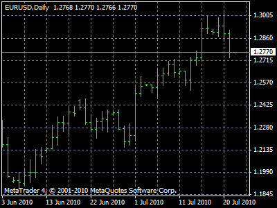
Bar charts are a staple in Forex trading, offering a clear view of price movements over specified timeframes. They represent vital data points that traders use to analyze trends and make informed decisions.
Understanding Open, High, Low, Close (OHLC)
The OHLC structure is the backbone of bar charts in Forex trading. Each bar represents four critical prices for a given period:
Open Price: The first traded price when the market opens.
High Price: The peak price reached during the trading session.
Low Price: The lowest price hit before the session closed.
Close Price: The final price at the session's end.
This simple structure allows traders to instantly assess market sentiment. A bar that closes higher than it opened indicates bullish momentum, while the reverse suggests bearish pressure. In fact, as Jesse Livermore famously said, "The market is never wrong; only opinions are." The OHLC data confirms this by illustrating genuine price movement without bias.
Analyzing Trends with Bar Charts
Bar charts are exceptional for Trend Analysis and Pattern Recognition. By connecting the highs and lows, traders can visualize uptrends, downtrends, and sideways movements. Here’s how to make the most of it:
Identify Trend Direction:
If bars consistently close higher, it's an uptrend.
If they close lower, expect a downtrend.
Spot Reversals:
Sharp shifts in OHLC data often signal a market reversal.
Volume Confirmation:
High trading volume accompanying price movement solidifies trend validity.
Bar charts don’t just show prices; they reveal the story of the market, helping traders make sharp, data-backed decisions.
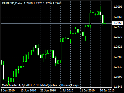
4.Candlestick Charts: The Trader's Favorite for Forex Analysis
Candlestick charts are the go-to choice for many Forex traders. They offer a visual edge for analyzing price movements and predicting market sentiment.
Candlestick Patterns for Forex Trading
Candlesticks are essential in Forex trading for visualizing currency market movements. They represent open, high, low, and close prices within a specific period. In technical analysis, traders often use candlestick patterns to gauge market sentiment and predict potential trends.
Common Candlestick Patterns:
Doji: Signals market indecision, often found in trend reversals.
Hammer: A bullish reversal pattern, signaling a potential price increase.
Engulfing: A larger candle completely engulfs the previous one, indicating strong momentum.
Why Use Candlestick Patterns?
Quick visual insights into market direction.
Effective for identifying potential entry and exit points.
Widely used for analyzing pips movement and exchange rate shifts.
Bullish and Bearish Signals Explained
In Forex trading, bullish and bearish signals help traders anticipate market direction. A bullish signal indicates rising prices, while a bearish signal suggests a potential decline.
Key Bullish Signals:
Bullish Engulfing: Indicates the start of an uptrend.
Morning Star: A three-candle pattern signaling a bullish reversal.
Key Bearish Signals:
Bearish Engulfing: Signifies a possible downtrend.
Evening Star: A reversal pattern showing weakening upward momentum.
"Trading without understanding bullish and bearish signals is like driving blind on a highway." — John Paul, Market Analyst
Reading Multi-Candlestick Formations
Multi-candlestick formations combine several candlesticks to reveal complex patterns. Recognizing these is crucial for analyzing price action in Forex.
Popular Multi-Candlestick Patterns:
Three White Soldiers: Indicates strong bullish sentiment.
Three Black Crows: A signal of a potential bearish reversal.
Doji Star: Often seen at market turning points, highlighting indecision.
Why Use Multi-Candlestick Formations?
They enhance pattern recognition, especially in volatile currency markets.
Ideal for spotting reversal and continuation patterns during trading setups.
Traders often use them in conjunction with technical analysis to validate signals.
Avoiding False Signals with Candlesticks
False signals can lead to poor trading decisions, especially in volatile markets. Incorporating signal confirmation methods helps reduce risk.
| Signal Type | Risk Level | Confirmation Techniques |
|---|---|---|
| False Bullish | High | Wait for a second bullish candle |
| False Bearish | Medium | Check for support break |
| Whipsaw Pattern | Very High | Use additional trading filters |
Tips for Avoiding False Signals:
Use signal confirmation: Don't trade on a single candlestick alone.
Incorporate support and resistance analysis: Helps filter out noise.
Apply trading filters: Such as moving averages, to smooth out irregular patterns.
By validating candlestick signals with additional trading filters, traders can minimize whipsaws and reduce unnecessary risk.
Candlestick charts remain essential for Forex traders due to their visual clarity and predictive potential. From recognizing basic patterns to understanding multi-candlestick formations, mastering these charts is crucial for making informed trading decisions. Combining candlestick analysis with risk management strategies enhances trading accuracy.
5.Renko and Heikin-Ashi Charts: Non-Traditional Forex Strategies
Renko and Heikin-Ashi are unique chart types that simplify price movement and highlight trends, making it easier for traders to spot market direction with less noise.

Features of Renko Charts
Renko charts are built with "Bricks" instead of traditional time-based candlesticks. Unlike standard charts, Renko focuses purely on price movement, filtering out minor fluctuations and emphasizing trends.
Time-Independent: Renko charts form new bricks only after a specified price change, ignoring time intervals.
Fixed Price Units: Each brick represents a fixed amount of price movement, which is set by the trader.
Trend Analysis and Support Resistance: Clear visibility of support and resistance levels makes trend analysis straightforward.
Noise Reduction: Small market movements are filtered, revealing the true direction of the market.
| Feature | Description | Benefit |
|---|---|---|
| Time Independence | Ignores time intervals | Focuses purely on price |
| Fixed Price Units | Each brick reflects set price value | Precision in trend spotting |
| Noise Reduction | Filters minor movements | Cleaner trend visibility |
Heikin-Ashi for Smoother Trends
The Heikin-Ashi method modifies the typical candlestick chart by using average prices, creating a smoother trend appearance. This makes it easier to spot market direction without the clutter of daily volatility.
Modified Candlesticks: Heikin-Ashi calculates its bars based on averages of Open-High-Low-Close values.
Noise Filtering: Unlike standard charts, Heikin-Ashi reduces noise, making trends more apparent.
Visual Clarity: Bullish and bearish trends are visually extended, helping traders stay in profitable trades longer.
"Heikin-Ashi is like driving on a freshly paved road—smooth and clear," says Forex analyst Michael Larsen.
When to Choose Alternative Charts
Choosing Alternative Charts like Renko or Heikin-Ashi depends largely on your trading strategy and market conditions:
For Trend-Focused Trading: If you want to ride long trends with minimal noise, Heikin-Ashi is ideal.
High Volatility Markets: Renko excels in filtering out noise during volatile market conditions.
Technical Analysis Needs: For clearer support and resistance levels, Renko outshines traditional charts.
Data Visualization: Both charts offer unique perspectives compared to Point and Figure or Kagi Charts.
Understanding the strengths of these alternative charts can significantly enhance your market analysis and decision-making.
6.Comparing Chart Types: Which Forex Chart is Best for Your Strategy?
Choosing the right chart type can make or break your Forex trading strategy. Let’s compare popular chart types to find the best fit for different trading styles.
Line vs. Bar Charts Analysis
When it comes to Data Visualization, both Line Charts and Bar Charts offer unique perspectives. Line Charts are great for plotting Time Series Data and spotting overall Price Levels trends. The X-axis typically shows time, while the Y-axis displays price. They’re simple but lack detail.
Bar Charts, on the other hand, show more granular data through Open-High-Low-Close (OHLC) values. These charts are excellent for Trend Identification and Comparative Analysis between different time periods. When precision matters, Bar Charts outperform Line Charts.
Expert Quote:
“Line charts are for quick trend snapshots, while bar charts dive into the nitty-gritty of price action.” - David Green, Forex Analyst
Candlestick vs. Renko Charts
Candlestick Charts are the go-to for visualizing Price Action with their vivid OHLC patterns. They effectively highlight Trend Analysis and Volatility Display, making them ideal for day trading.
On the flip side, Renko Charts filter out minor fluctuations, focusing on Time Independent Charting. These charts use Renko Bricks to emphasize strong price movements, which helps reduce market Noise. They’re perfect for traders who want a cleaner, trend-focused view.
Scalping vs. Swing Trading Charts
Scalping: Uses shorter Chart Timeframes (1-5 minutes) to catch quick Price Swings. Scalpers rely on precise Entry Points and Exit Points, using tools like Moving Averages for Risk Management.
Swing Trading: Prefers longer timeframes (4 hours to daily) to capture Market Liquidity and trend changes. Charts like Heikin-Ashi smooth out noise, helping traders set Profit Targets with minimal risk.
Best Chart Types for Volatile Markets
| Chart Type | Best for | Key Feature |
|---|---|---|
| Candlestick Charts | Day Trading | Real-time Price Swings |
| Renko Charts | Trend Following | Noise Reduction |
| Heikin-Ashi Charts | Swing Trading | Smooth Trends |
| Point and Figure | Long-Term Analysis | Breakout Strategies |
In highly volatile markets, Candlestick Charts capture rapid changes, while Renko and Heikin-Ashi Charts reduce noise for a clearer trend view. For breakout strategies, Point and Figure Charts shine by filtering out small price movements.
Choosing the right chart for your strategy depends on your trading style and the market’s volatility. Test different chart types to see what works best for your approach!
7.How to Choose the Right Forex Chart for Successful Trading?
Choosing the right Forex chart is crucial to aligning with your trading goals and adapting to changing market behavior. Let's dive into the two key considerations.
Aligning Chart Type with Trading Goals
Selecting the appropriate Chart Types based on your Trading Goals is the first step to successful Forex analysis. Here's what you should consider:
Trading Strategy – Are you a day trader, scalper, or swing trader? Candlestick charts work best for quick decisions, while Line charts are ideal for long-term analysis.
Investment Horizon – If you’re focusing on long-term growth, Bar charts provide a broader perspective of historical price movements.
Technical Indicators and Timeframes – Match your indicators like MACD, RSI, and Moving Averages with the right chart to optimize analysis.
Risk Management – Renko charts are great for filtering out market noise, making it easier to set stop-losses effectively.
Asset Selection – Some charts are better suited for specific assets—Heikin-Ashi for trending markets and Renko for volatile ones.
"A chart is not just a display; it's a strategic mirror reflecting your trading goals." – John Murphy, Author of Technical Analysis of the Financial Markets
Adjusting Charts Based on Market Behavior
Forex markets are dynamic; your charts should be too. Here’s how to stay adaptive:
Monitor Price Action and Trend Analysis: Regularly watch support and resistance levels to catch breakouts or reversals.
Apply Volatility Indicators: Tools like the Bollinger Bands and ATR (Average True Range) help you understand market swings.
Dynamic Timeframes for Real-Time Updates: Shift between 1-minute, 5-minute, and 1-hour charts during high volatility periods.
Pattern Recognition Techniques: Spot evolving patterns like Head and Shoulders or Double Tops for timely decisions.
| Market Behavior | Chart Adjustment Technique | Indicator Used |
|---|---|---|
| High Volatility | Use Renko Charts | Average True Range (ATR) |
| Trending Market | Switch to Heikin-Ashi | Moving Averages |
| Sideways Movement | Apply Line Chart Analysis | Bollinger Bands |
Adapting your charting methods based on Market Behavior not only improves precision but also strengthens your Risk Management.

Conclusion
Mastering the types of charts in Forex trading is like having the right tool for every job. A Line Chart gives you the big picture, a Bar Chart uncovers the details, and a Candlestick Chart tells the market’s story at a glance. If you’re looking to cut through the noise, Renko Charts have your back, while Heikin-Ashi smooths out the bumps for clearer trends.
As trading legend Jesse Livermore once said, “The game taught me the game. And it didn’t spare me the rod while teaching.” Choosing the right chart isn’t just about data; it’s about finding clarity in chaos. Apply what you’ve learned, and make every trade count.
For beginners, the Line Chart is often the best choice due to its simplicity. It displays only the closing prices for a given time period, making it easy to understand market trends without getting overwhelmed by complex indicators.
Candlestick charts are powerful tools for visualizing market sentiment and predicting price movements because they represent:
Open, high, low, and close prices within a specific timeframe.
Patterns like "Doji," "Engulfing," and "Hammer," which indicate market reversals or continuations.
Color-coded signals (green for bullish, red for bearish) to quickly assess market direction.
Yes, many traders use multiple chart types for better analysis. For example, a trader might use:
Line Charts to identify long-term trends.
Candlestick Charts to spot entry and exit points.
Bar Charts for more granular price movement analysis.
For short-term trading, Candlestick Charts are generally preferred due to their detailed representation of price action within short intervals. Heikin-Ashi charts are also useful for filtering out market noise.
Renko Charts differ from traditional charts because they focus solely on price movement rather than time intervals. They create bricks only when price moves a specific amount, which helps to:
Eliminate market noise.
Highlight clear trends.
Simplify spotting breakouts and reversals.
Heikin-Ashi charts are ideal for trend-following strategies but may not be the best for precise entry and exit points because they smooth out price action, making real-time price representation slightly delayed.
Absolutely. Choosing the right chart type for your trading strategy can greatly influence your understanding of market trends, entry and exit timing, and overall trading accuracy. For example, swing traders often prefer Candlestick Charts, while trend traders may benefit more from Renko Charts.


